Introduction
Overview
Process
Redesign rationale
Customer & audience
How might we?
Onboarding requirements
Streamlining the onboarding
Solution
Translating solutions to good UX
Designing for system consistency
Design impact
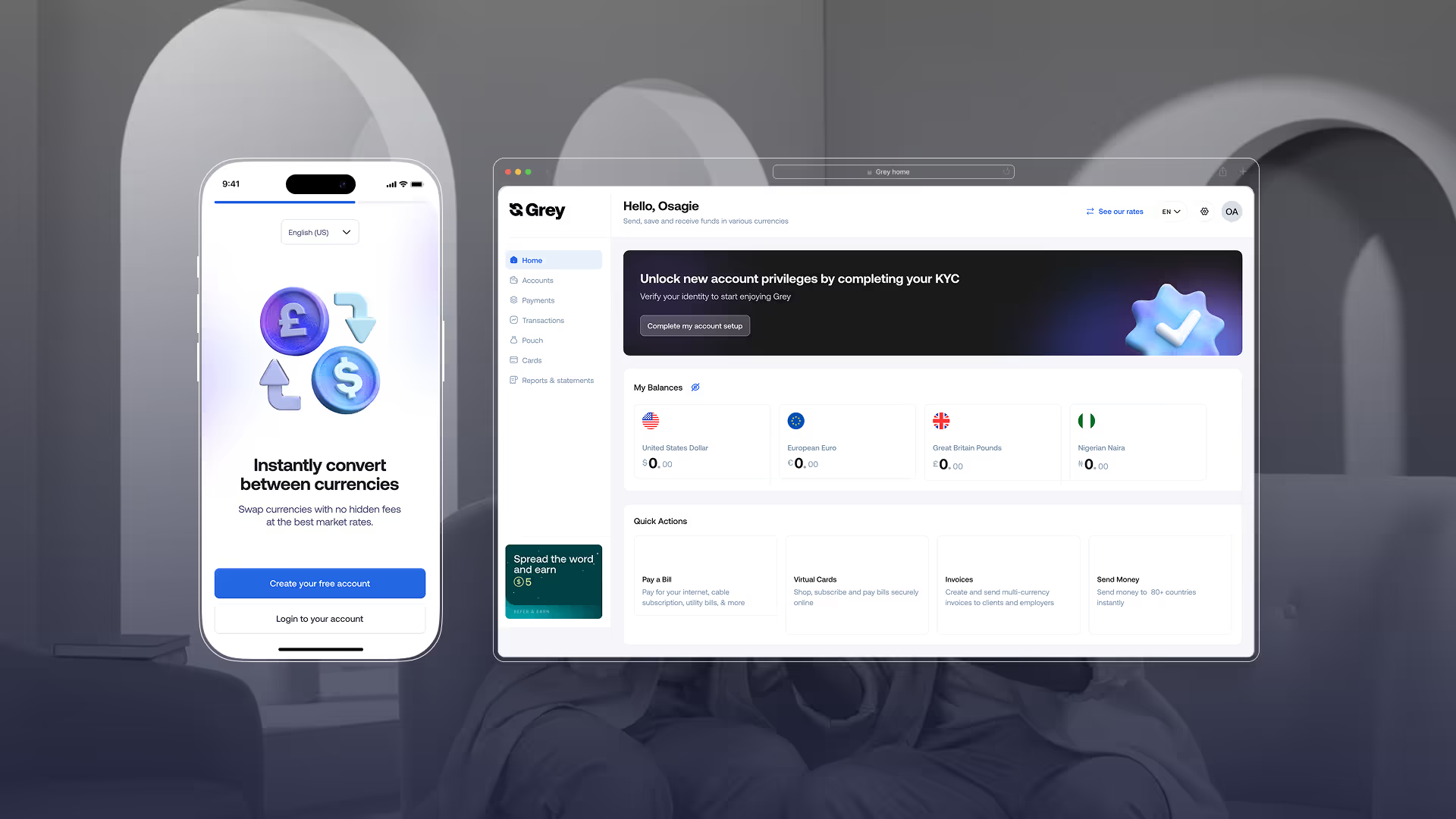
GREY
Adaptive onboarding for a personalized fintech journey
INDUSTRY
Fintech
MY ROLE
Product design, research, analysis
YEAR
Early 2023
TEAM
1 designer, 1 product manager, 5 engineers, 1 Fraud & KYC compliance officer, 1 content writer.
OVERVIEW
Grey is a financial technology platform offering inclusive global banking services to over 1million digital nomads, freelancers, and travelers in Europe, MEA, LatAm, and Southeast Asia by simplifying the process of receiving, sending, exchanging, and managing multiple currencies in one app. In 2023, we set out to redesign the onboarding process to help users get into the app faster, explore its features effortlessly, and take their first actions early—driving engagement and empowering users.
The redesigned onboarding flow has played a pivotal role in this success, bringing over 1m+ new users into the platform and counting (as of Oct 2024), while ensuring a seamless and engaging experience from the start.
View design impact
The redesigned onboarding flow has played a pivotal role in this success, bringing over 1m+ new users into the platform and counting (as of Oct 2024), while ensuring a seamless and engaging experience from the start.
View design impact
Defining the redesign rationale
As Grey’s user base grew and features expanded, it became clear that the onboarding process needed to evolve. The redesign aimed to create a more intuitive, efficient, and engaging experience, reflecting the diversity of our users and the platform’s capabilities.
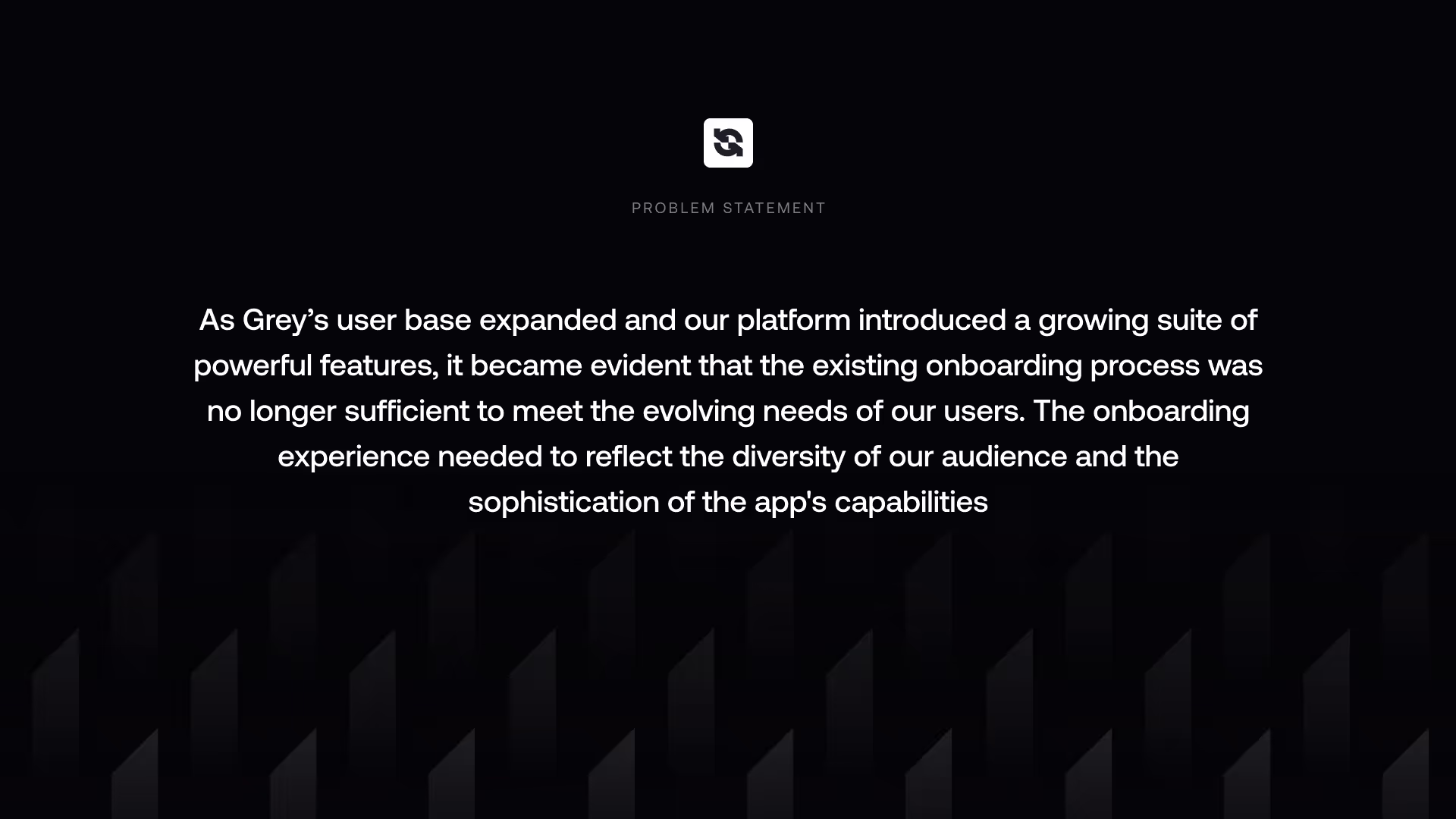
To further understand the problem, it is important to identify the key issues that compound it. The problem statement guided us in identifying these issues, which are identified below.
🔒More compliance requirements
In fintech, ever-evolving regulations require constant updates to the onboarding process for compliance.
📋Longer flow due to compliance requirement Compliance requirements have extended onboarding, creating friction for users seeking swift access.
🌍Localized onboarding
Grey's onboarding lacked localization to meet users' diverse needs, languages, and regulations.
📟Dated user interface.
The onboarding interface was outdated and inconsistent with the app's overall design system.
🎯Varying user needs
Users face delays as they must meet all app requirements to access needed features.
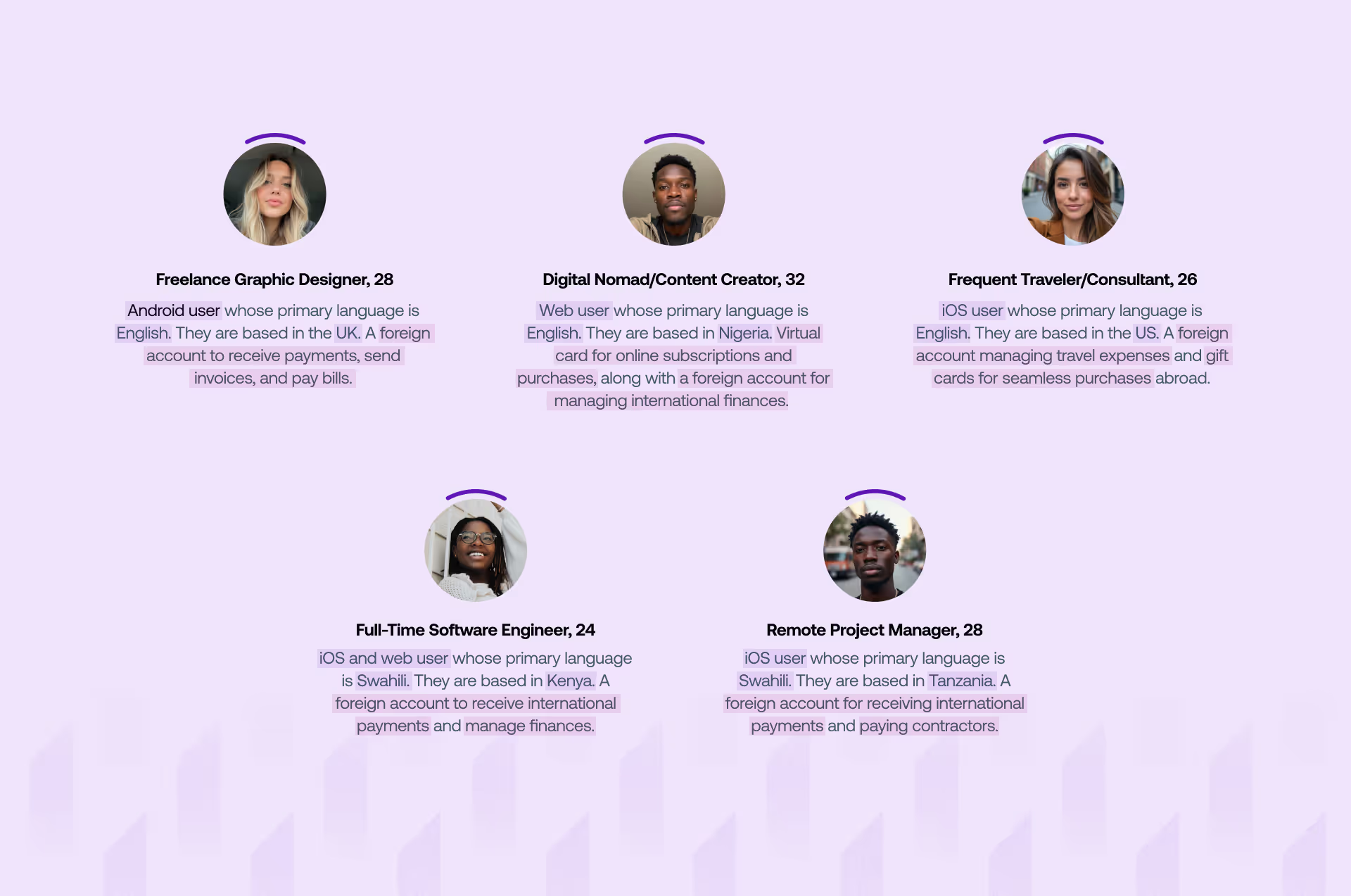
Customers and Audience
Grey serves a diverse audience, including digital nomads, freelancers, and travelers. To address their needs, we created personas based on our customer base, highlighting the reasons customers use Grey and shaping the redesign to cater to these user types.
How might we?
To address the identified issues and transform them into opportunities for improvement, we focused on framing data-driven questions that would guide the redesign process. These questions aim to uncover the best ways to enhance the onboarding experience while balancing compliance requirements with usability, improving personalization, and aligning the interface with user expectations.
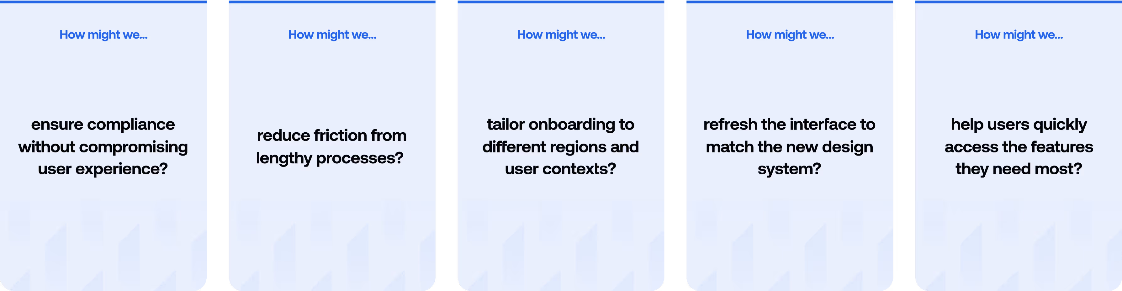
By personalizing these questions, we can better empathize with our customer personas.
- How might we ensure a freelancer in the UK can meet compliance requirements without feeling overwhelmed, so they can quickly manage invoices and payments?
- How might we reduce friction from lengthy onboarding processes to help a traveler in the USA quickly access the foreign account and gift card features?
- How might we localize onboarding to cater to a digital nomad in Nigeria, ensuring their unique financial needs are addressed seamlessly?
- How might we refresh the interface to align with the new design system, making the user experience more intuitive across platforms like iOS, Android, and Web?
- How might we enable a freelancer or a traveler, to access the features they need quickly without being held up by unnecessary steps?
The critik homepage immediately introduces the user to the contents of the site. The contents are well classified into sections to reduce the visual clutter as well as prevent content overload for the user.
The homepage also prioritizes the subscribe option for converting users for email marketing.
The homepage also prioritizes the subscribe option for converting users for email marketing.
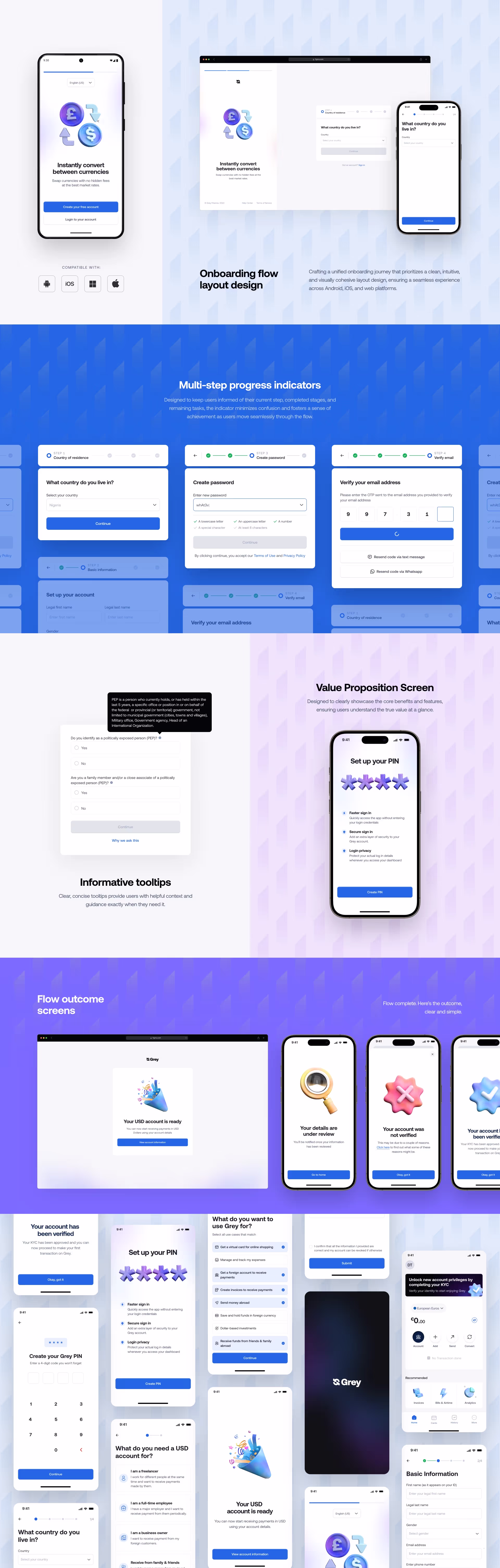
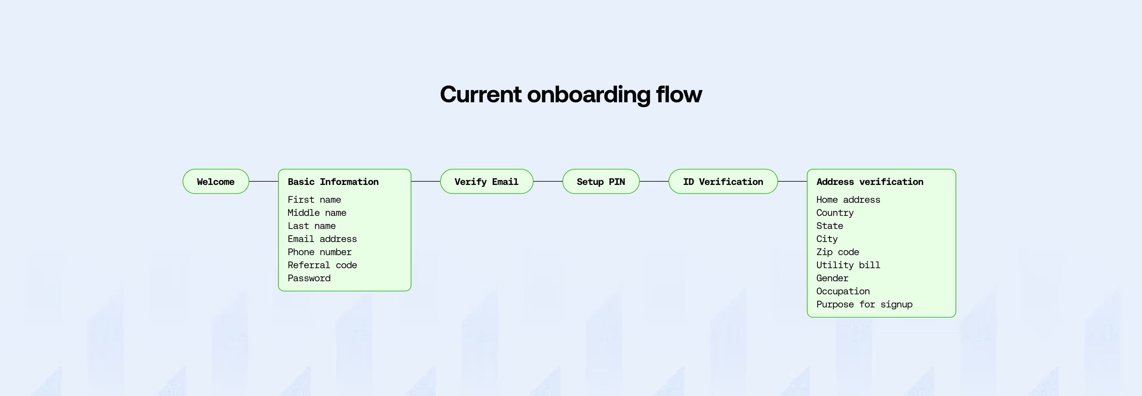
Identifying and updating onboarding requirements
To tackle the problems, I collaborated closely with the compliance team, working directly with a compliance officer assigned to the redesign. Together, we identified the necessary updates to the onboarding process to meet new regulatory requirements per region. These updates were added to the existing flow, allowing us to get a high-level view of all the steps involved. At the same time, we made a list of all the information we would be requesting from our users in each of those regions. This helped us assess the overall length of the process and pinpoint areas where users might encounter friction.
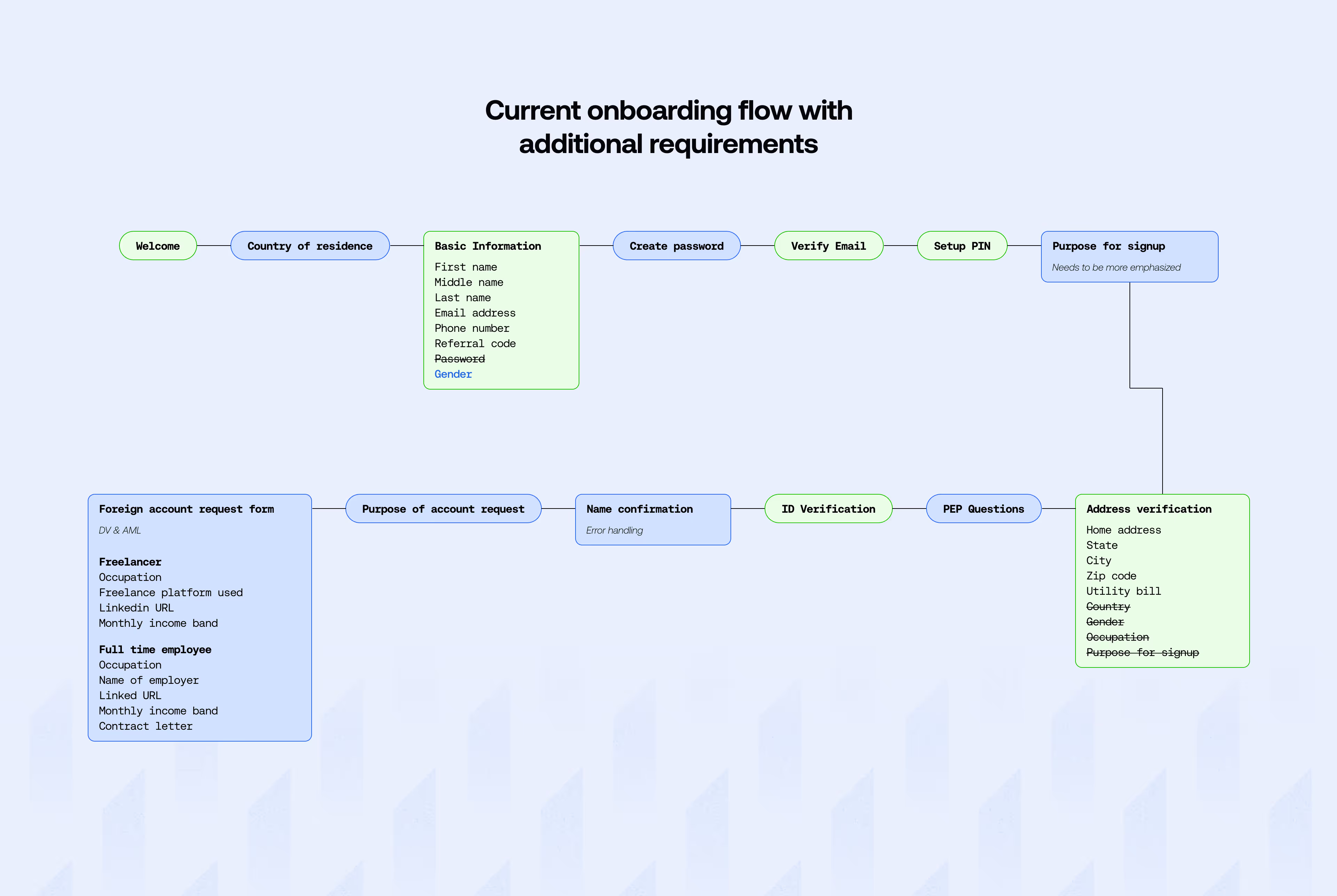
Streamlining the onboarding process
After mapping out the updated onboarding flow and assessing its length, it became clear that the process was becoming too lengthy and potentially overwhelming for users. We began to explore ways to reduce friction and create a more efficient experience without compromising compliance or the quality of onboarding.
Segmented onboarding
We adopted this approach because it allows us to grant users access to specific features based on their completed onboarding level. With this approach, users get to experience the value of the platform without needing to complete all compliance steps upfront.
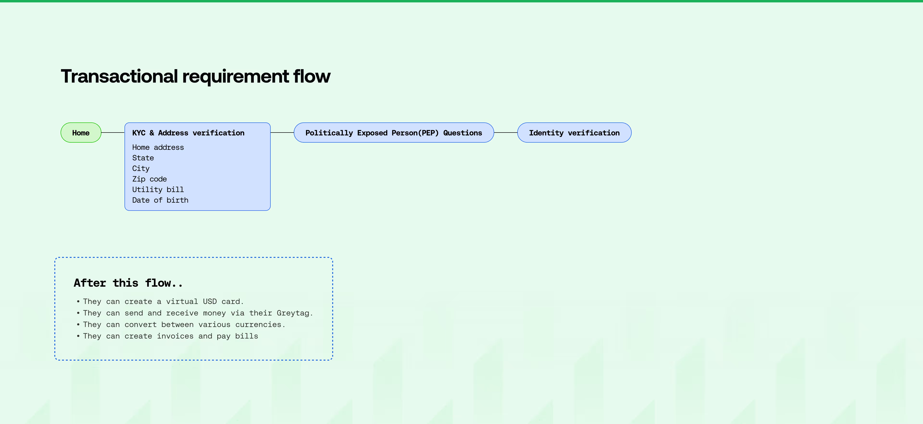
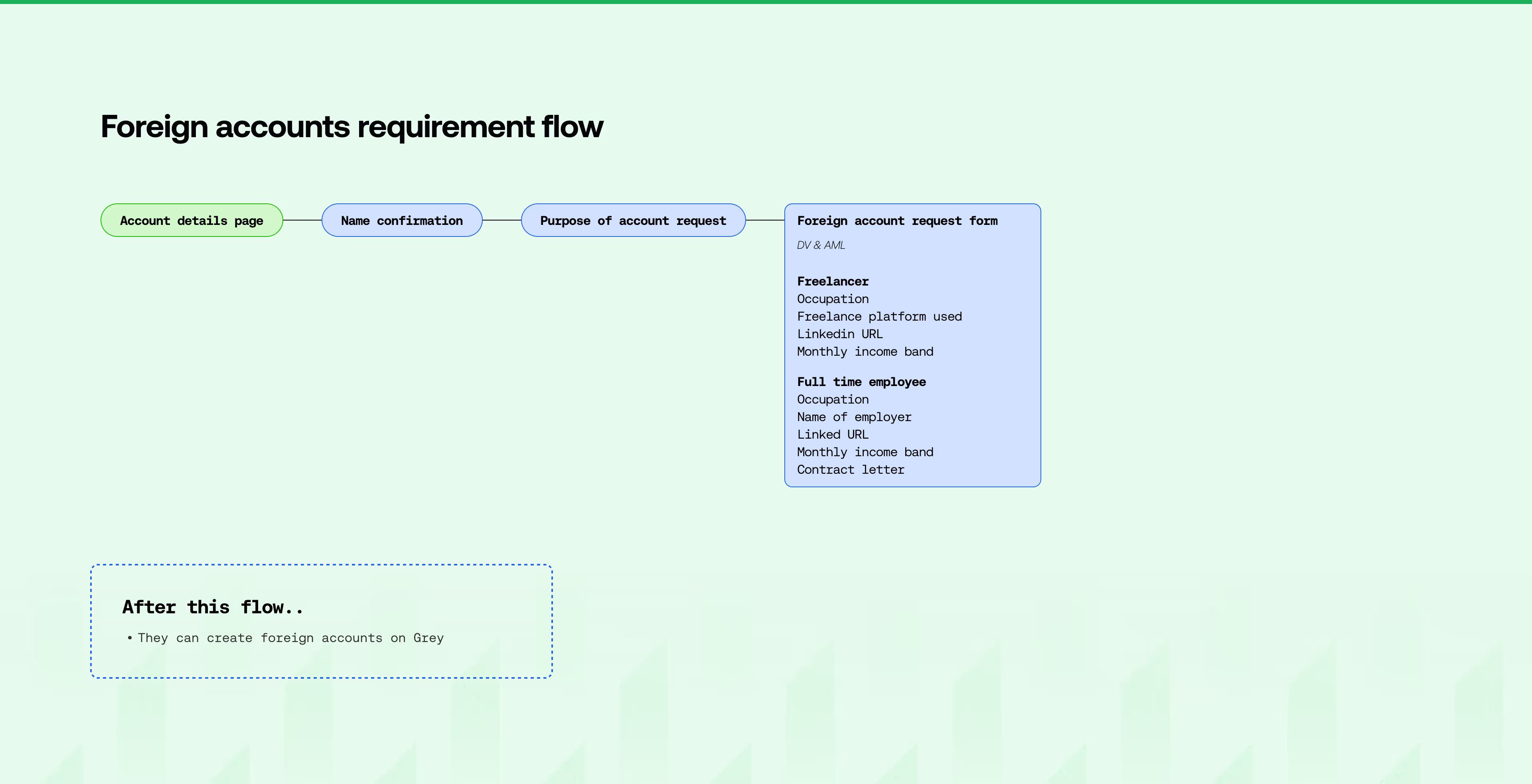
To achieve this, I collaborated with the compliance team to define feature-requirement buckets and conducted working sessions with the design team to group features with similar requirements. Together, we created onboarding segments that streamlined the process while ensuring full adherence to compliance standards. We concluded on three segments, the basic onboarding flow, transactional requirement flow, and foreign account request flow
To achieve this, I collaborated with the compliance team to define feature-requirement buckets and conducted working sessions with the design team to group features with similar requirements. Together, we created onboarding segments that streamlined the process while ensuring full adherence to compliance standards. We concluded on three segments, the basic onboarding flow, transactional requirement flow, and foreign account request flow
Conditional onboarding
We complemented the segmented onboarding with conditional onboarding, which provided a personalized experience based on user attributes like location, role, and needs. This ensured that users only encountered requirements relevant to their specific context.
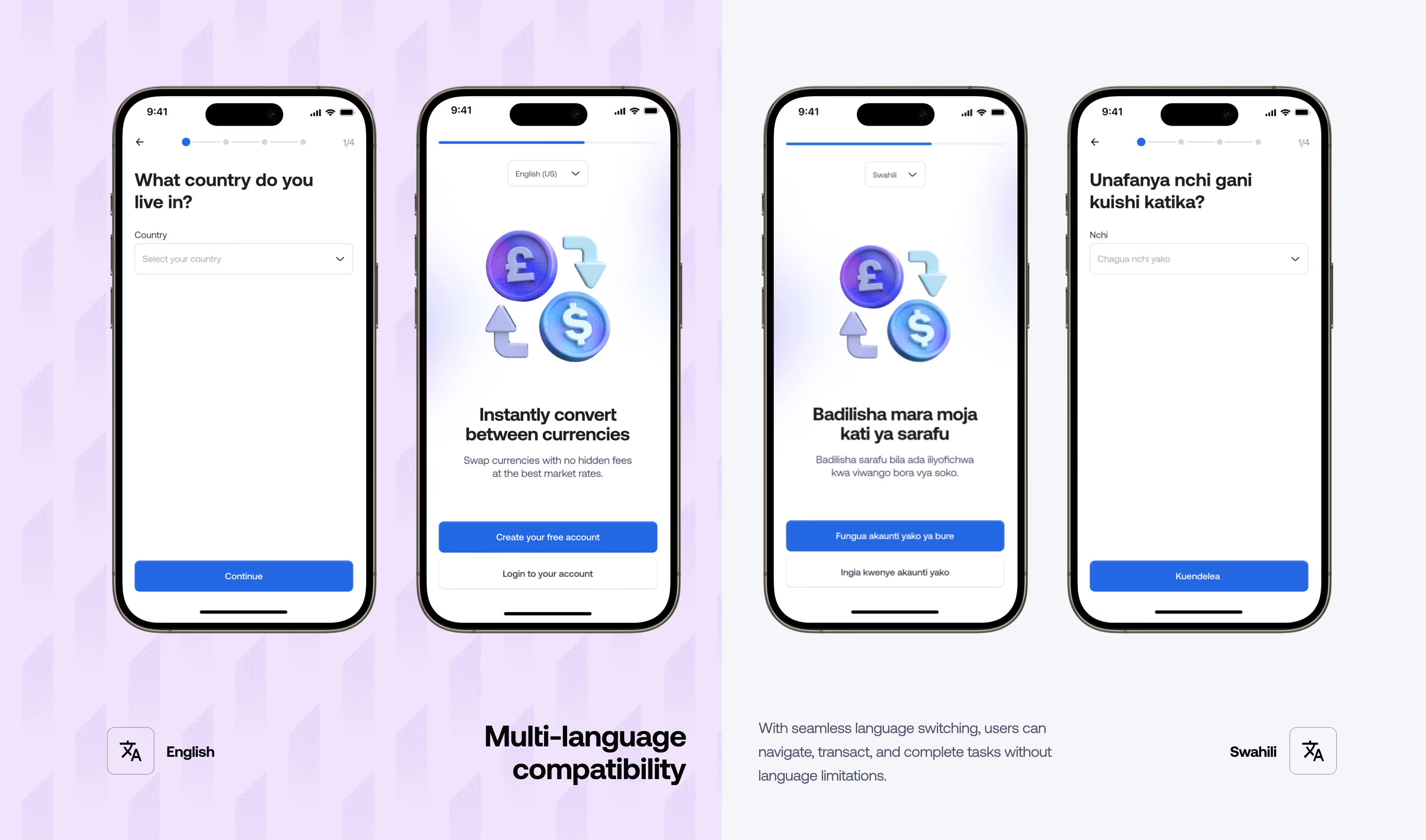
Language switching
The redesign introduced multi-language compatibility to ensure users can interact with the platform in their preferred language. With seamless language switching, users can navigate, transact, and complete tasks without language limitations.
Translating solutions into user-friendly experiences
Once the solutions were developed, the next challenge was ensuring they were presented to users in a way that enhanced their experience and drove conversions. We employed two key strategies: soft entry previews and progressive disclosure.
Genres are a very distinct classification of music. With that in mind, reviews on Critik also follow that classification. Users can access reviews on Critik based on genres.
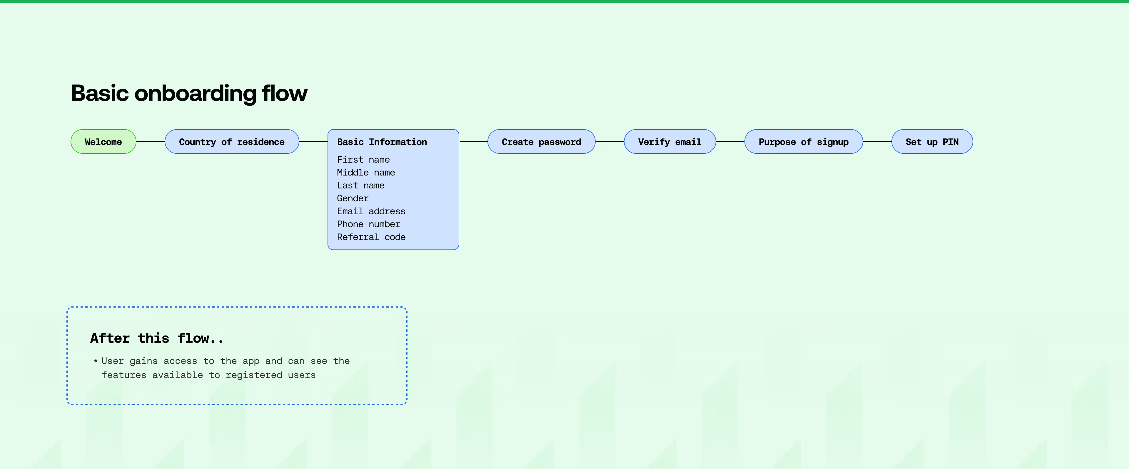
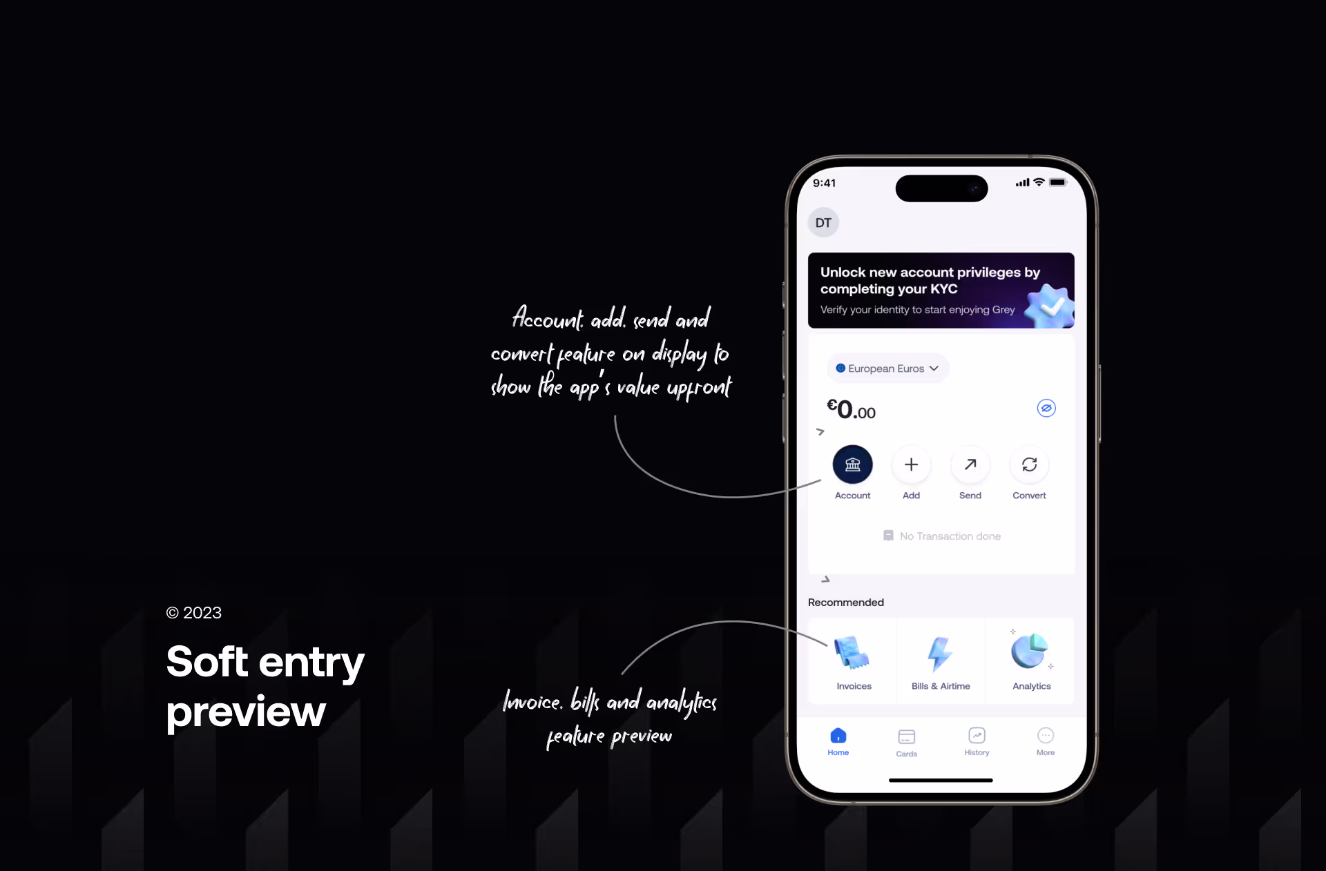
Soft entry previews
This approach allows users to enter and explore the app without completing the full onboarding process. In our onboarding flow, users gain access to the app after completing the basic onboarding flow. The other onboarding segments are deferred until they try exploring the app's features. This prioritizes early engagement by showing users the app’s value upfront, even if their onboarding is incomplete.
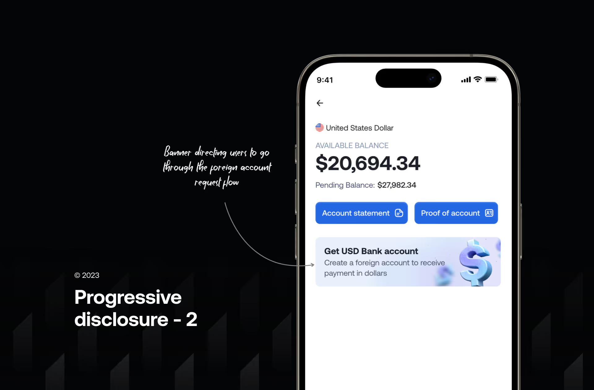
Progressive disclosure
This approach introduces users to onboarding steps gradually as they explore the app. After the basic onboarding, users are prompted to complete additional steps, like the transactional requirements flow, only when accessing specific features, such as creating a virtual card or sending invoices.
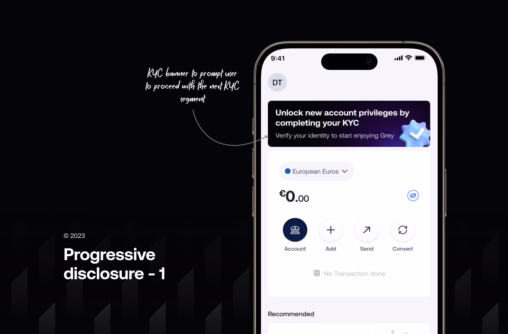
Upon completing the transactional requirements flow, users are presented with the foreign account request flow when needed, unlocking access to their foreign account. This ensures a smooth, personalized experience by showing only the necessary steps based on users' immediate goals.
Designing for system consistency
I audited the interface, updating components and typography to align with the new design system and improve navigation.
The articles page makes the reading experience very comfortable. The article content is in focus. There is also a preview section for the music currently being reviewed.
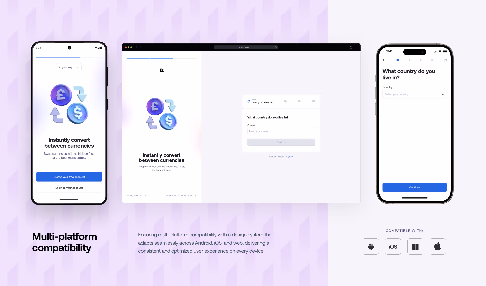
Multi-platform compatibility
The redesign focused on enhancing consistency across devices by ensuring responsive layouts adapt to different screen sizes and resolutions without compromising usability or aesthetics.
Design impact
- Design decisions helped slash the time to first use by 67%.
- The average time for completion and approval of KYC moved from 1hr 20 mins to 38 mins on Android, from 38mins to 24 mins on iOS, and from 1hr 21mins to 40mins on the web with a large portion of the users completing in 10-20mins.
- The onboarding flow onboarded 385,000+ customers in its first year (2023). As of October 2024, it had onboarded 1m+ users into the platform.

